
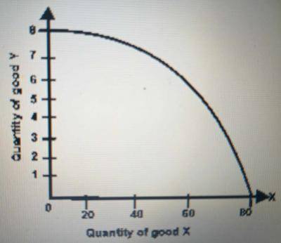
The diagram above represent
- Supply curve
-
Production possibility curve

- indifference curve
- Demand curve
The correct answer is: B
Explanation
The digram above represent the production possibility curve which is also known as production possibility frontier, production possibility boundary, or transformation curve.