The table below shows the mark distribution of candidates in an aptitude test for selection into the public service.
| Marks (in %) | Freq |
| 44 – 46 | 2 |
| 47 – 49 | 5 |
| 50 – 52 | 11 |
| 53 – 55 | 20 |
| 56 – 61 | 42 |
| 62 – 64 | 46 |
| 65 – 67 | 36 |
| 68 – 70 | 9 |
| 71 – 73 | 3 |
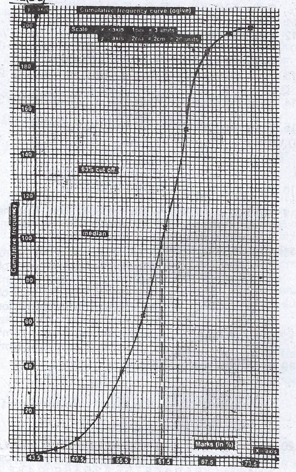
(a) Make a cumulative frequency for the distribution
(b) Draw the cumulative frequency curve.
(c) From your graph, estimate the median mark.
(d) The cut-off mark was 63%. What percentage of the candidates was selected?
Explanation
(a)
| Marks (in %) | Freq | Class boundaries | Cum Freq |
| 44 - 46 | 2 | 43.5 - 46.5 | 2 |
| 47 - 49 | 5 | 46.5 - 49.5 | 7 |
| 50 - 52 | 11 | 49.5 - 52.5 | 18 |
| 53 - 55 | 20 | 52.5 - 55.5 | 38 |
| 56 - 61 | 42 | 55.5 - 61.5 | 80 |
| 62 - 64 | 46 | 61.5 - 64.5 | 126 |
| 65 - 67 | 36 | 64.5 - 67.5 | 162 |
| 68 - 70 | 9 | 67.5 - 70.5 | 171 |
| 71 - 73 | 3 | 70.5 - 73.5 | 174 |